
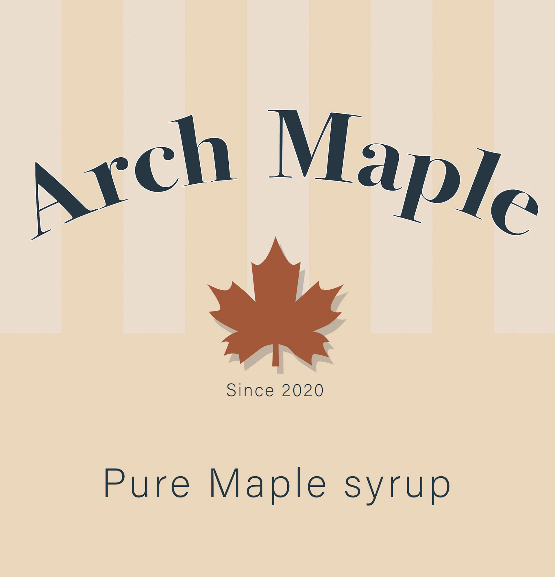
Logo : Arch Maple
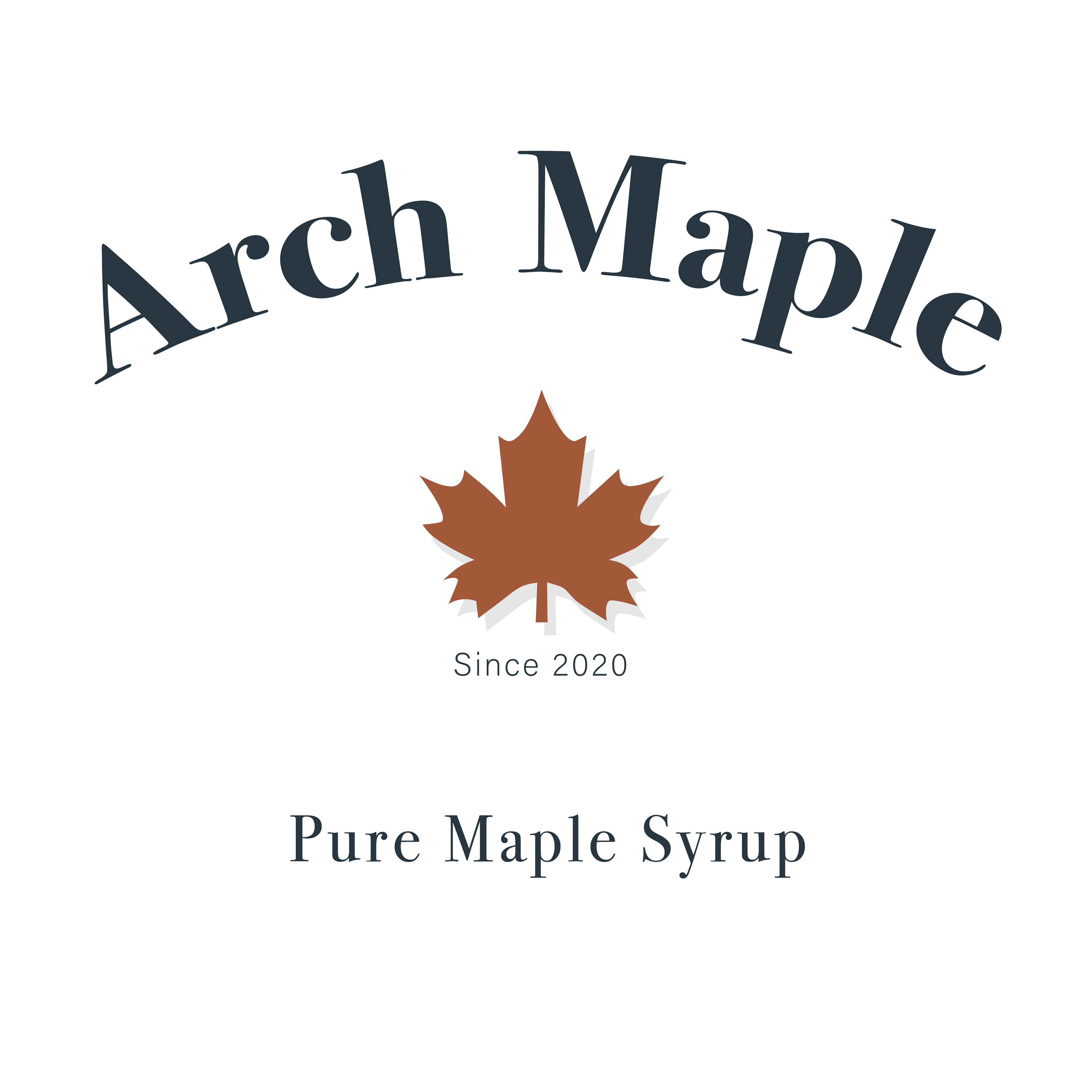
Arch Maple is a family-owned maple syrup producer. This project involved developing the core brand identity and designing the bottle labels, with an emphasis on restraint, clarity, and longevity. The visual system uses rich, grounded colours and minimal detailing to create a quietly premium, timeless presence.

The colour palette draws from the deep, rich tones of maple syrup, anchored by navy and softened with subtle turquoise accents for balance and contrast.
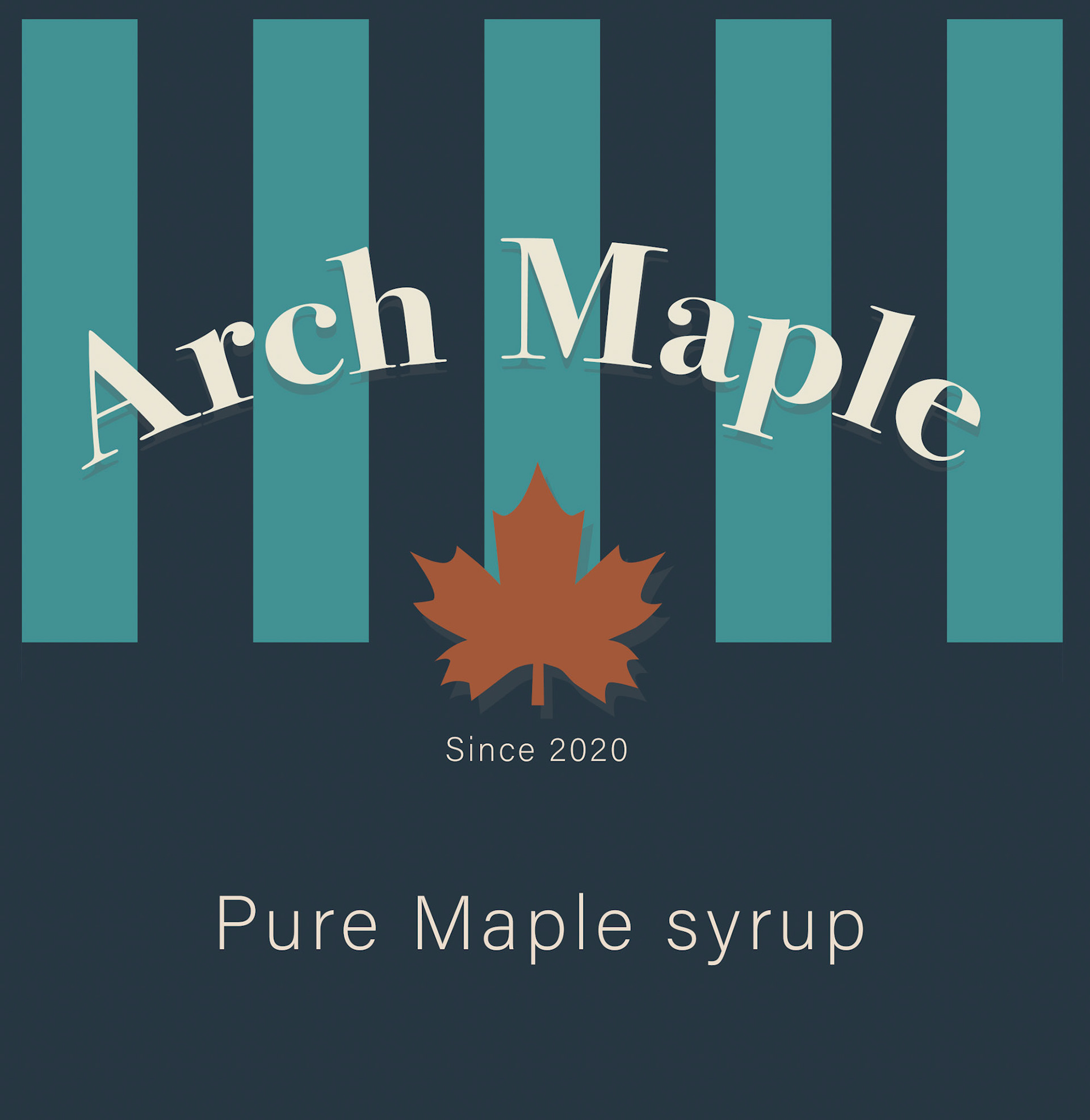
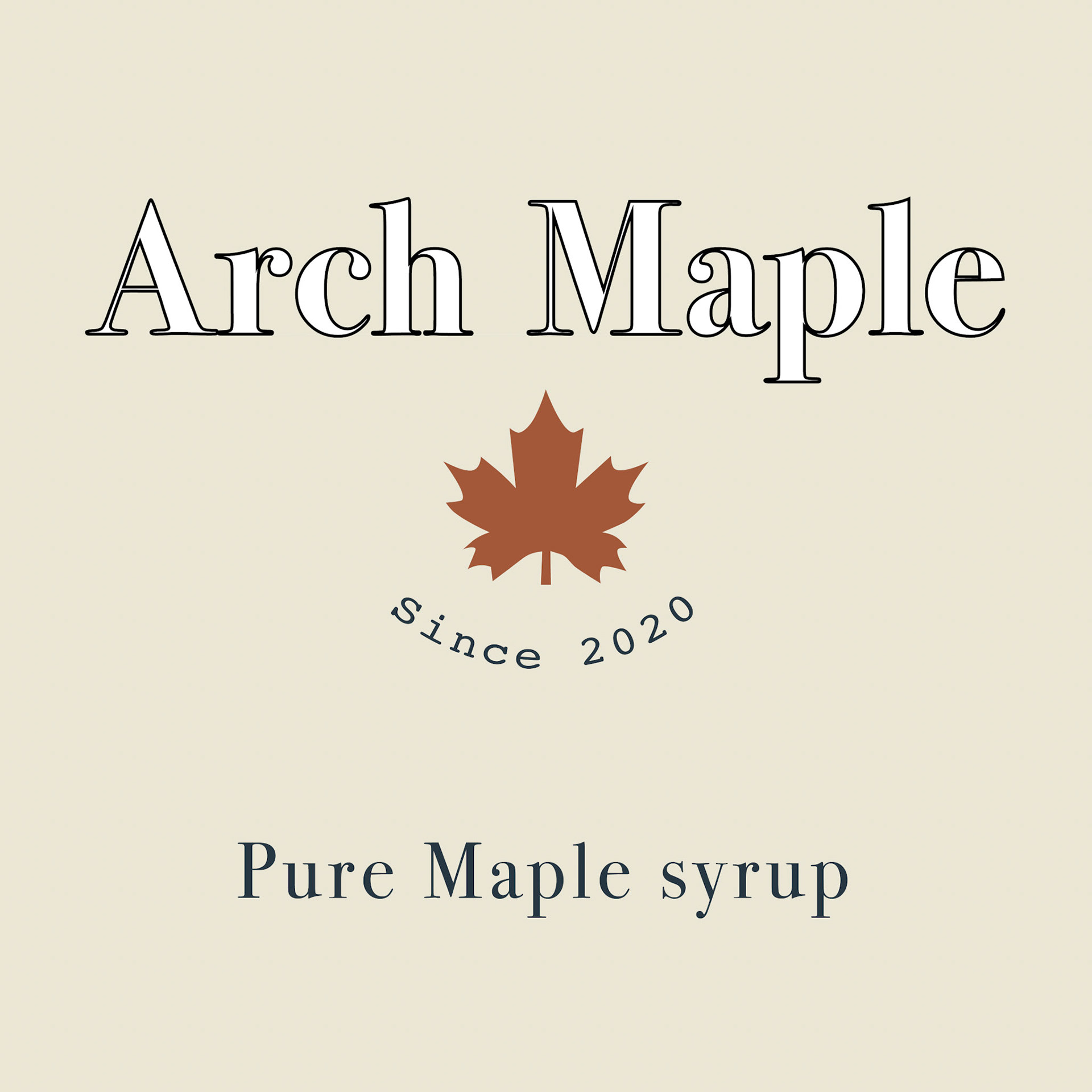
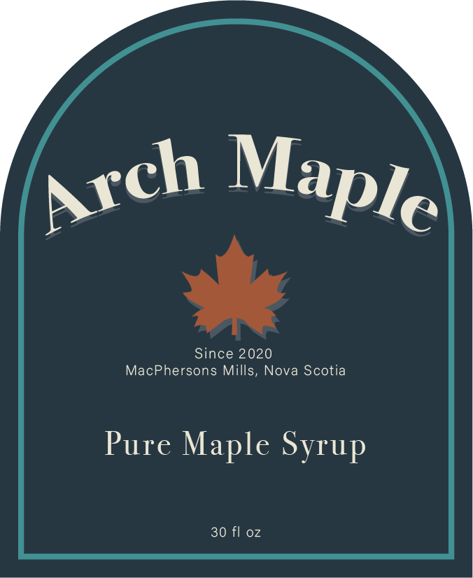
Proposed Designs
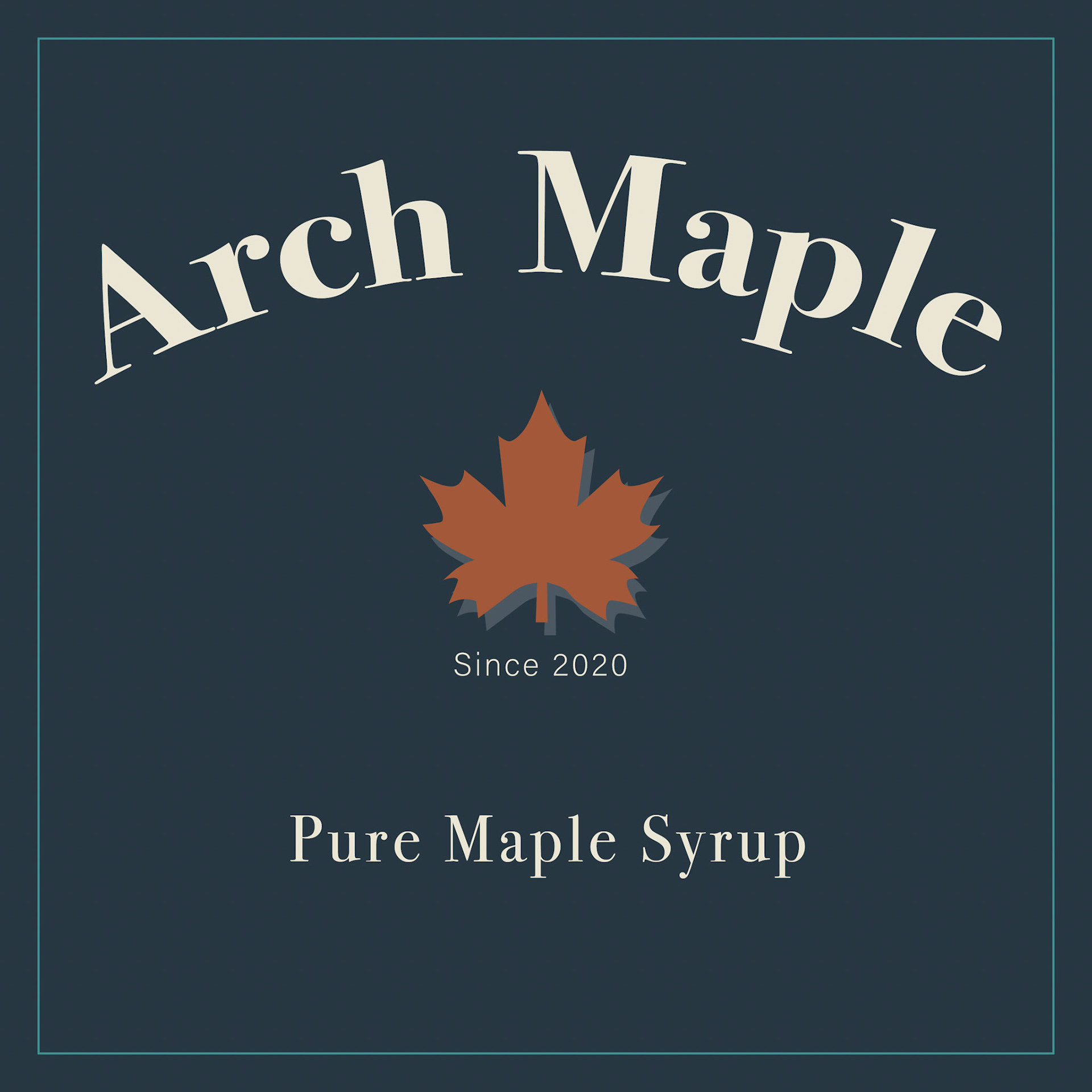
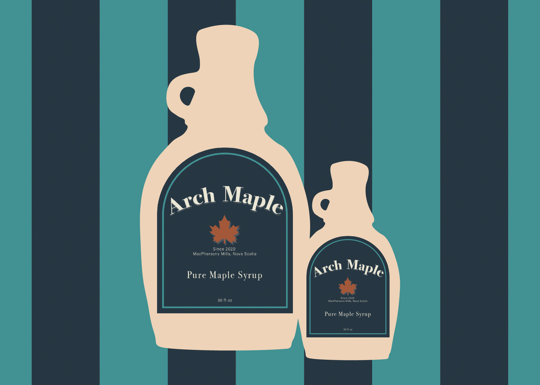
Final Design
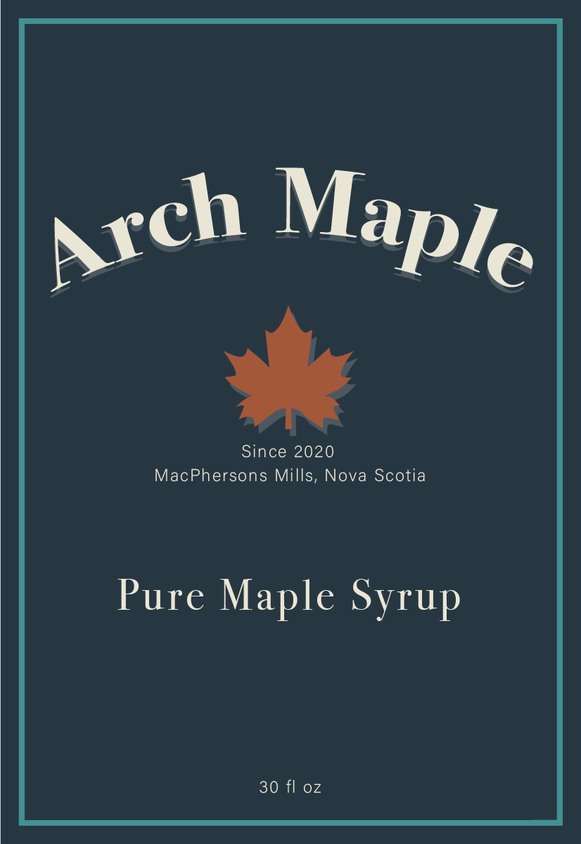
This concept was selected from the initial design explorations. Based on client feedback, I refined the label to include production details and volume information, then adapted the layout across two bottle formats using the provided measurements.
The final piece is intended for textured, embossed stock, using materiality to reinforce a refined, premium finish.
Project time 8 hours