
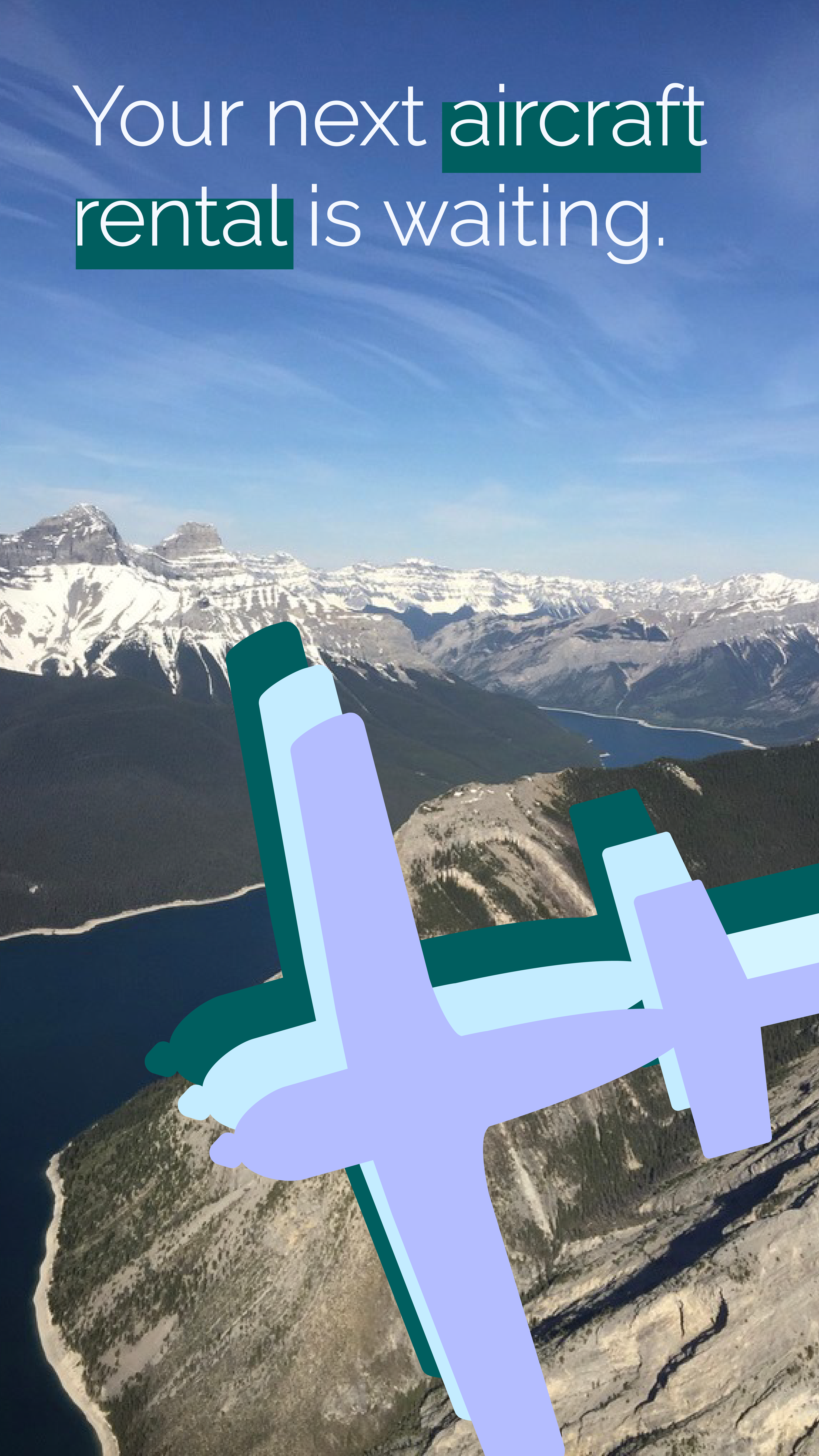
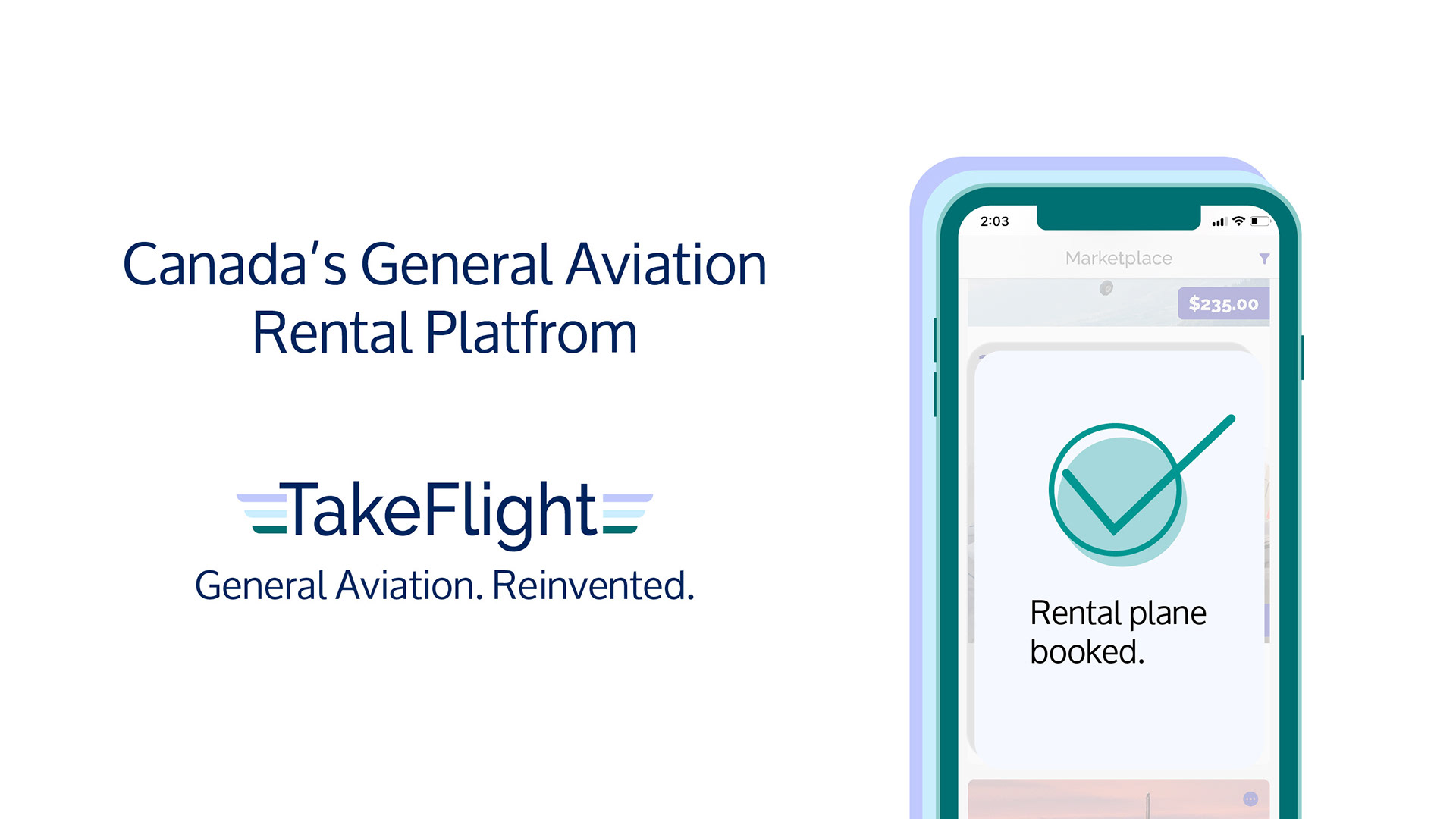
Brand Development
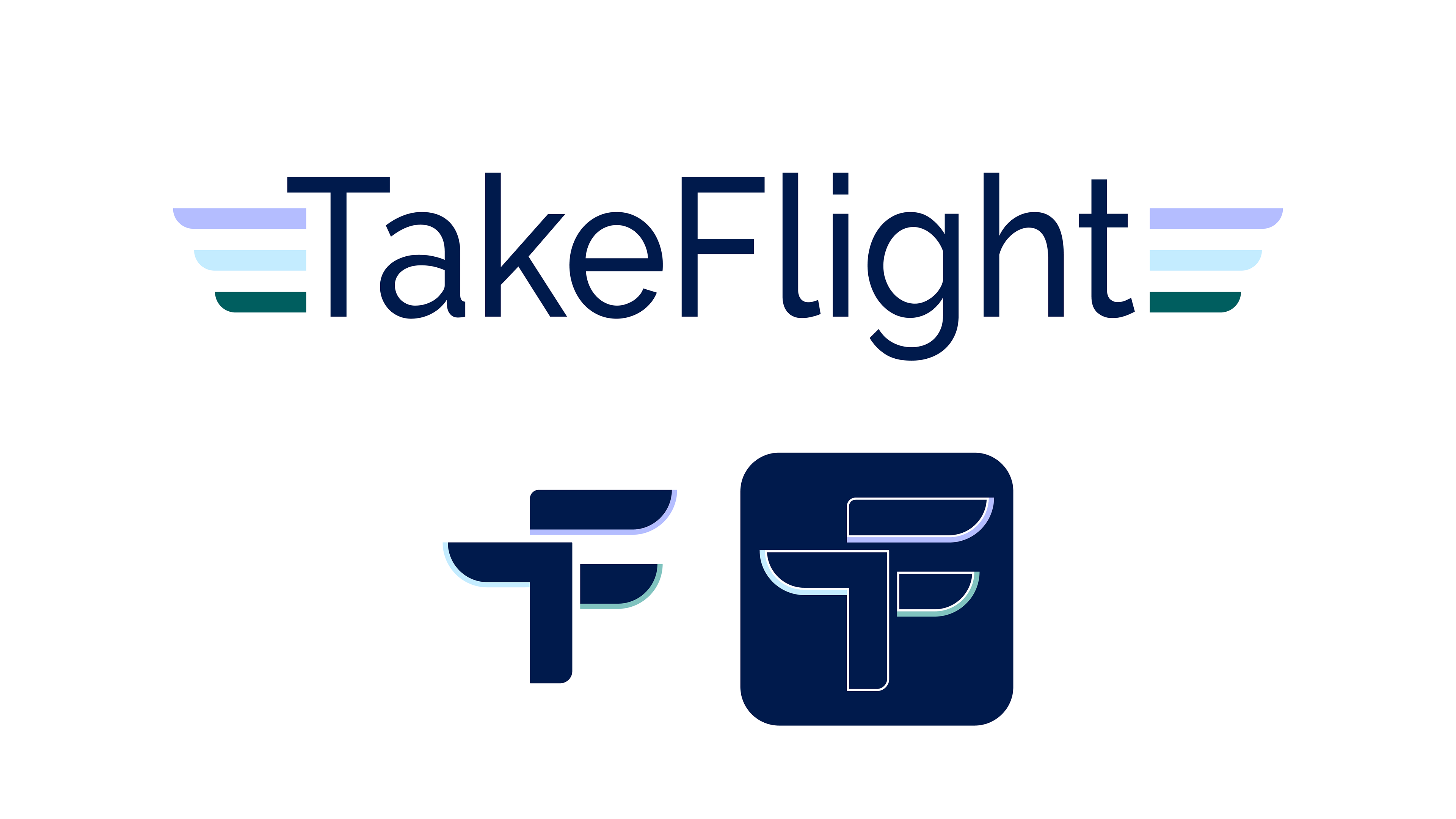
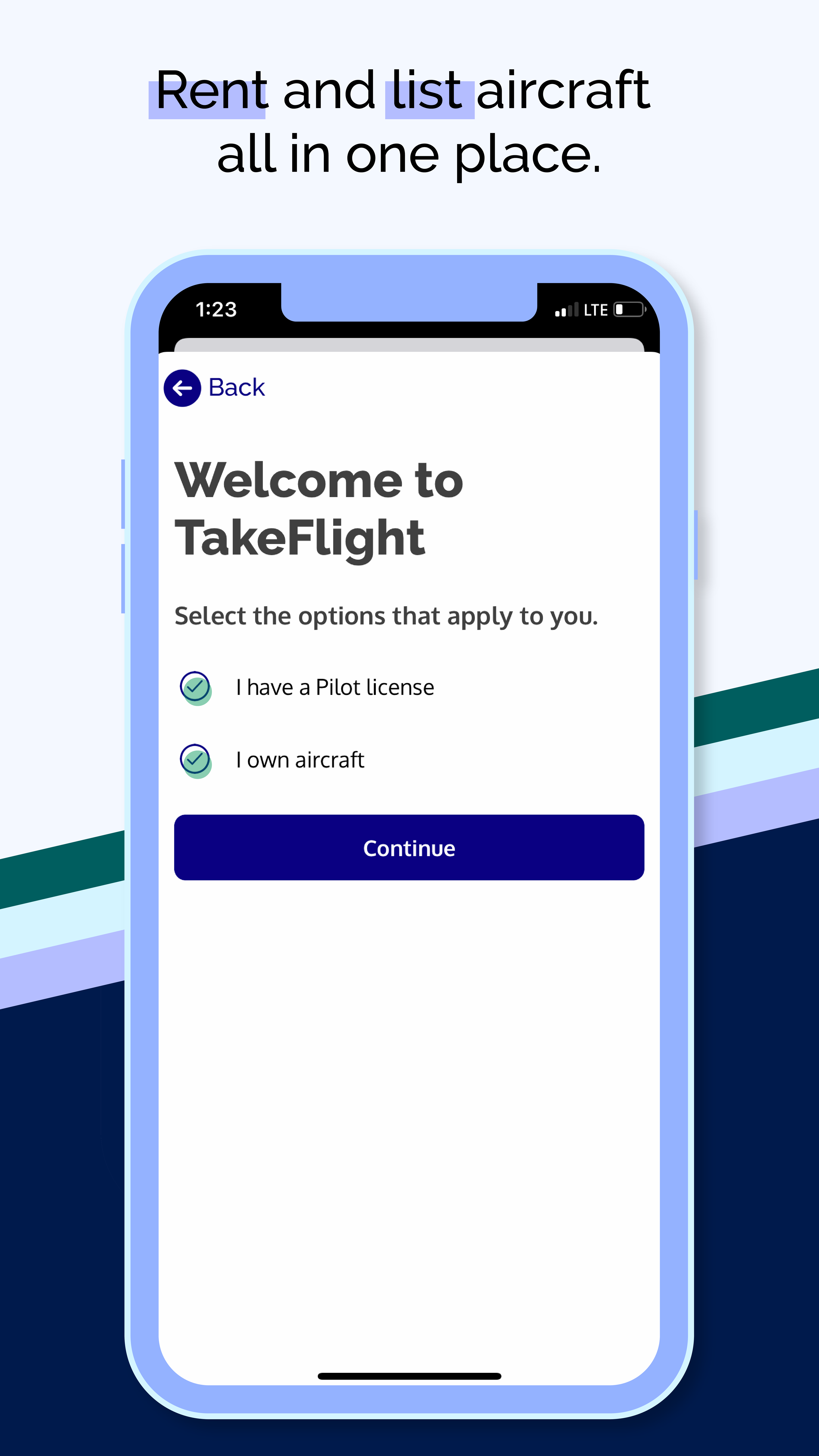
I led the brand identity for Take Flight, a mobile marketplace for general aviation rentals, with a focus on longevity, clarity, and broad appeal. The visual direction draws from early commercial aviation, an era defined by trust, craftsmanship, and progress, reinterpreted through a contemporary lens to feel current rather than nostalgic.
The wordmark draws on traditional pilot pins, with a deconstructed T and F for the logo, the two unified by a shared wing form. A restrained palette of light and dark blues establishes credibility and calm, while forest green and lilac introduce subtle contrast and a modern feel without disrupting the cool, professional tone the brand required.
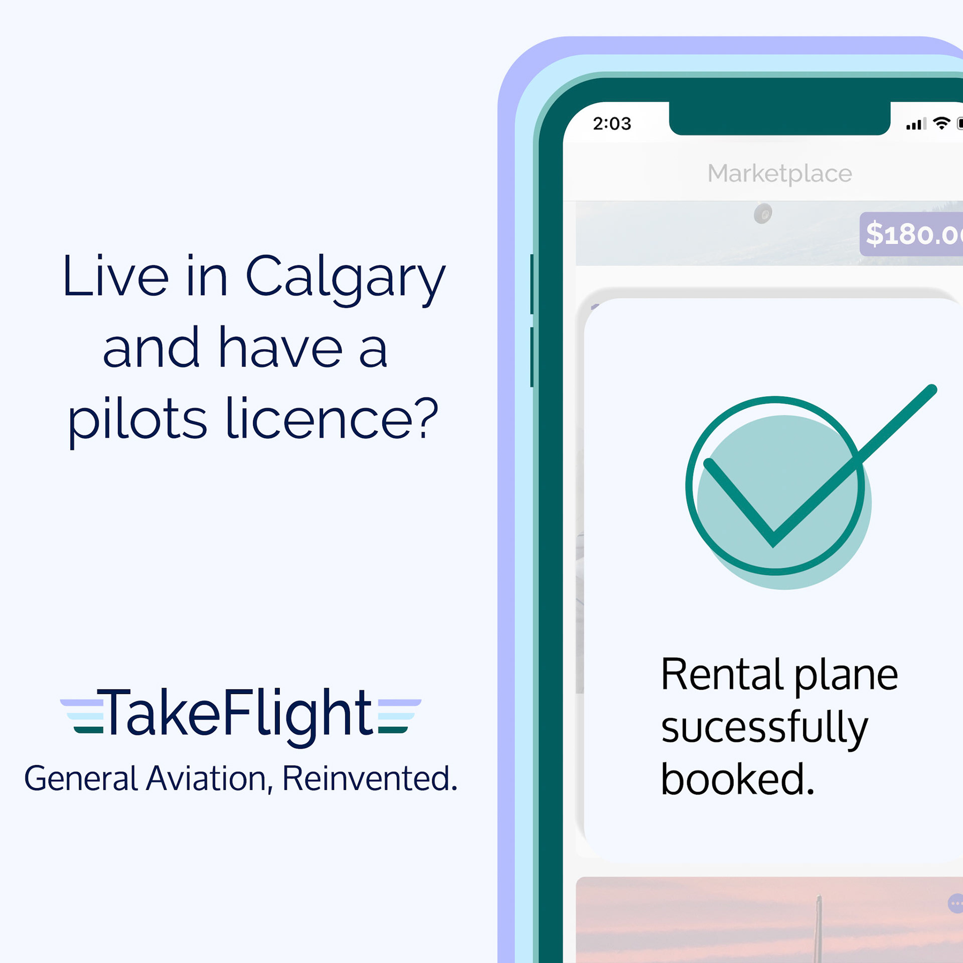
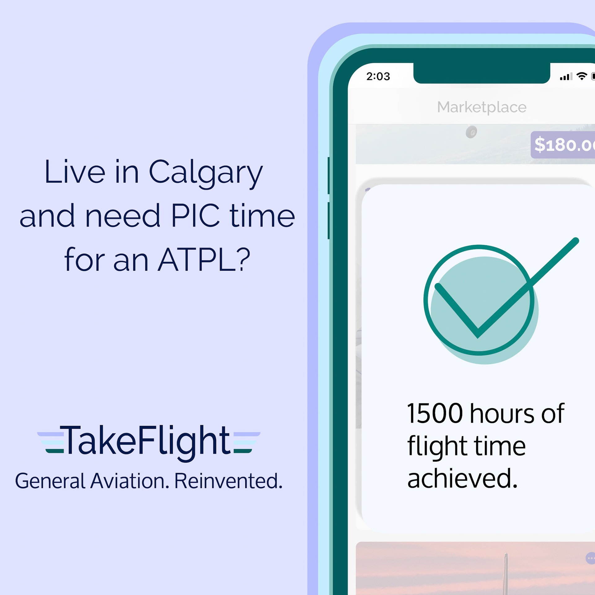
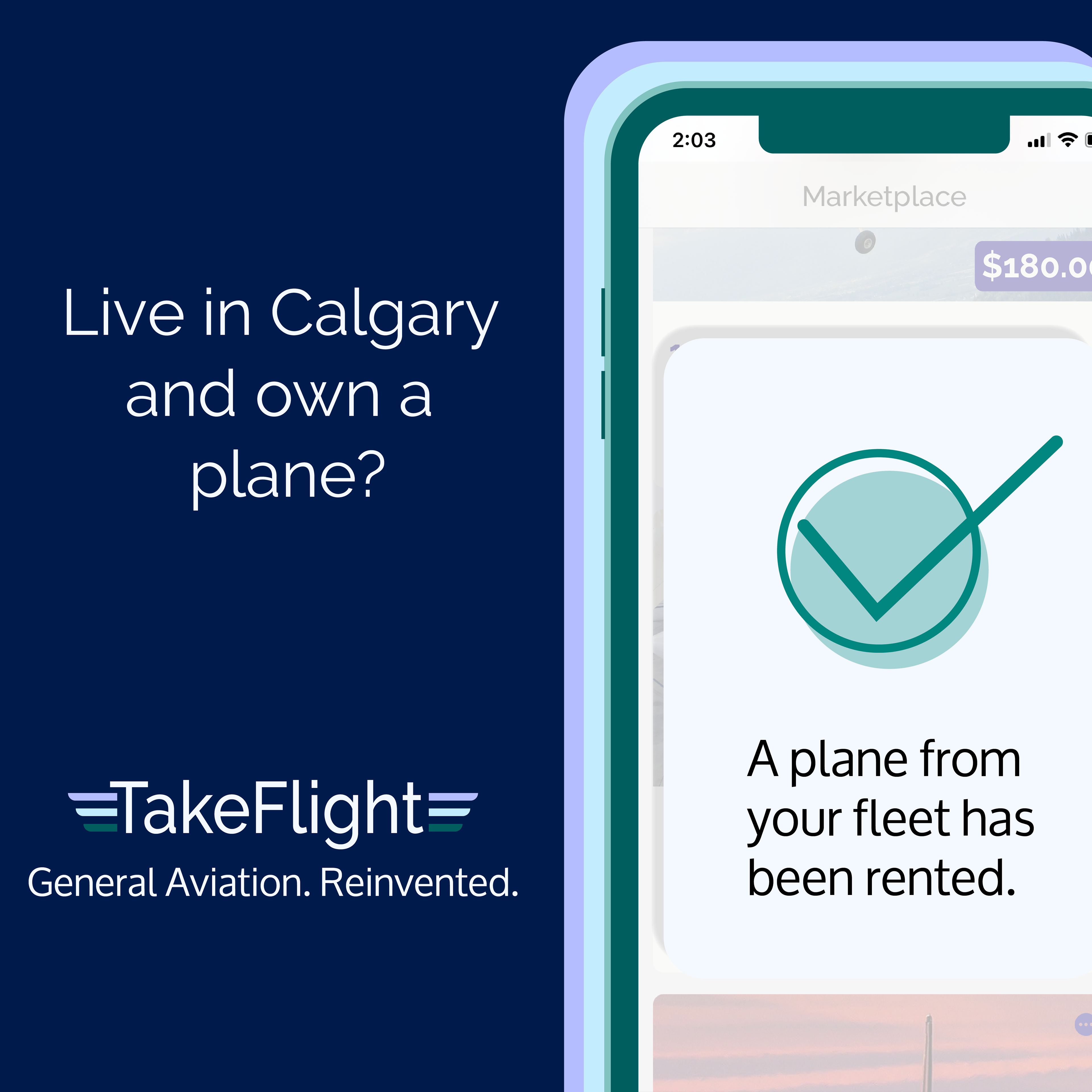
Initial Advertising Campaign
The goal of this campaign was to build brand awareness and introduce Take Flight to the Calgary market. The campaign ran on Instagram, Facebook, and LinkedIn.
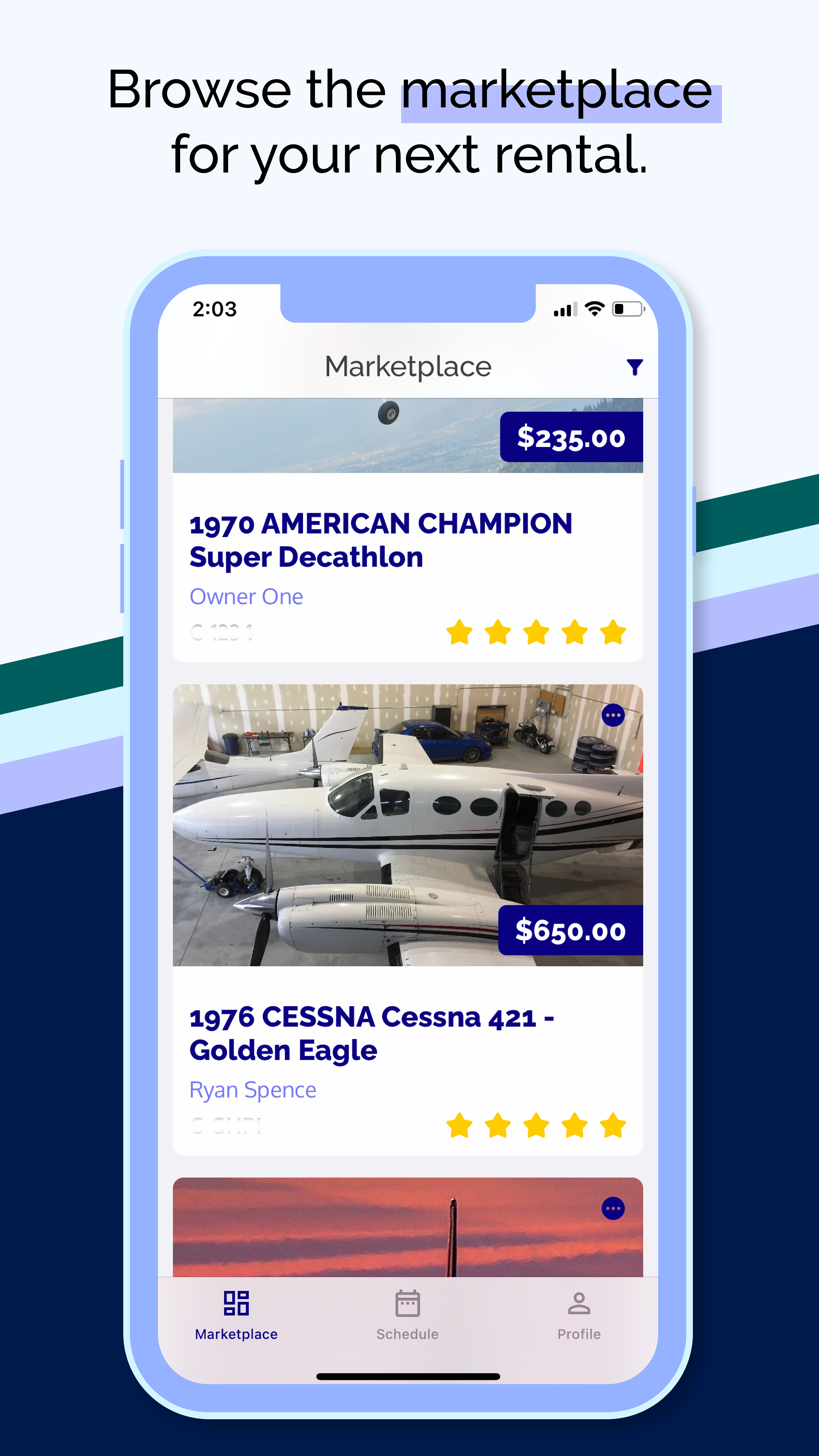
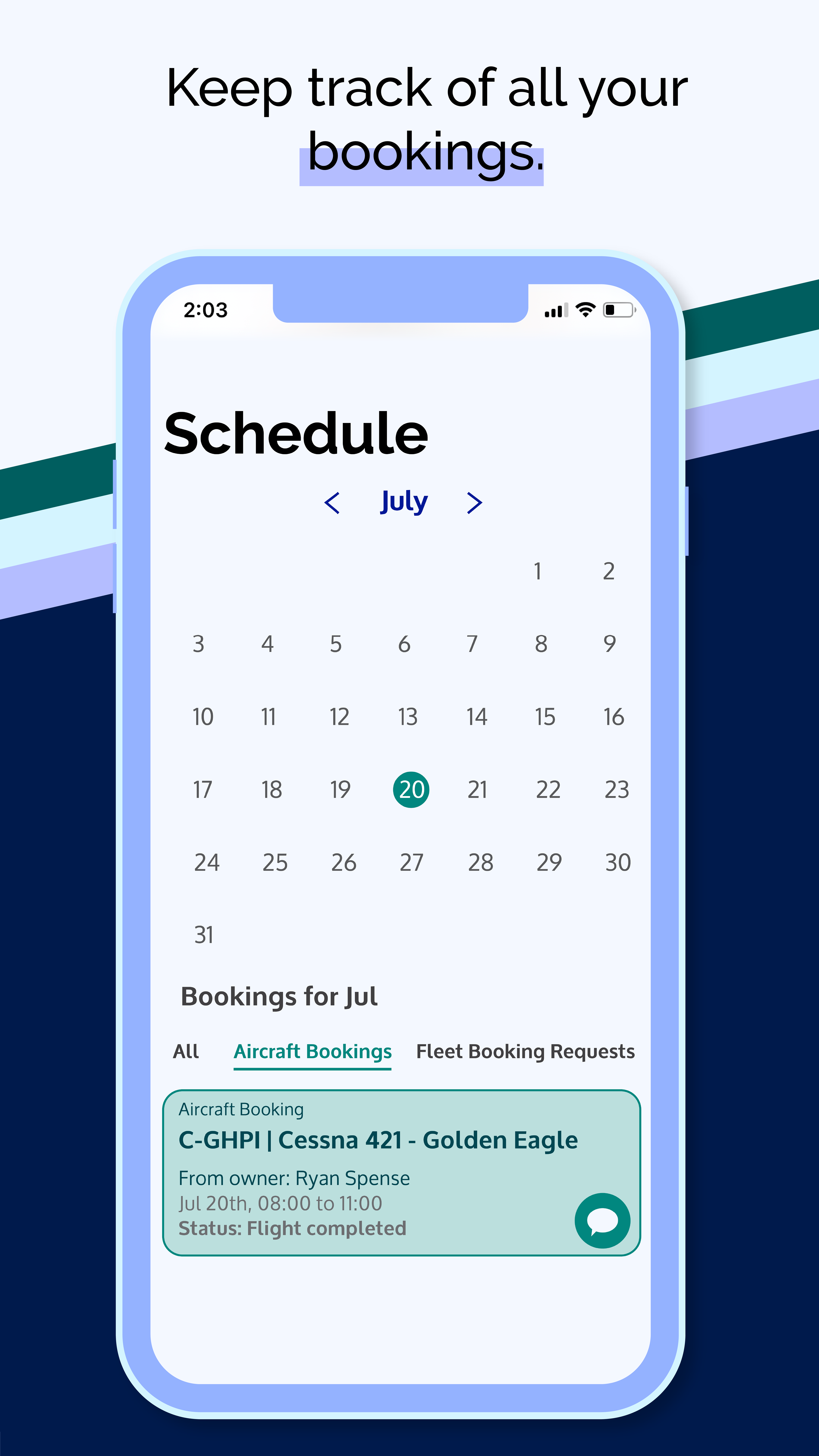
"With rising fuel costs, it's becoming increasingly more expensive to rent with a flight school. Plane owners typically have less overhead, which means they can rent for cheaper. To rent from plane owners in the current market you have to search Kijiji and Facebook marketplace like you're hunting for a used sofa. The purpose of Take Flight is to make independent aircraft rentals less like hunting for used furniture and more like renting a house or car, saving pilots time and money." - Jorden Archibald
Below are the links to the social media accounts I manage for the company. I have done all of the illustrations, captions and editing of the LinkedIn article posts.
Holiday Videos